Length of Life inequality
Introduction
Life is not distributed equally among individuals. Some persons live longer than others. This variation is in part due to genetic differences and intangible factors like good or bad luck,
which cannot be changed easily. In part it also depends on the total amount of resources that are available in the society in which one lives and the way these resources are distributed among
the population members.
These last components, the available resources and the way they are distributed within societies, are of special interest, because they can -- potentially -- be influenced by policy measures. Whether such measures may make a difference depends on the relative size of these components compared to the other (less changeable) factors.
Aim
In this project we aim to gain insight into the relative importance of these changeable and less changeable components, by looking at differences in adult
length of life inequality among human populations. Adult length of life is defined here as the total number of years persons over age 15 will live, or -- equivalently -- the age at which
these persons will die.
If populations at more or less the same level of development have about the same level of length of life inequality, this indicates that the size of the changeable components is relatively
small compared to the more stable components. If, on the other hand, populations at similar level of development vary much in length of life inequality, the size of the changeable components
is probably substantial.
In this last case, the variation in length of life within societies may for a sizable part be due to the way the society is organized and -- hence -- be susceptible to policy measures. Our analysis provide strong evidence that this is indeed the case.
Approach
The information needed to determine the degree of length of life inequality for a given population in a certain year is available in life tables, which contain data on total population and
number of deaths in that year, broken down by age and sex. On the basis of this information, the distribution of length of life (or age at death) can be computed. Length of life inequality is
measured by computing an inequality measure over this distribution.
To make the broadest possible comparison, we have brought together as much life tables as possible from many different sources. We succeeded in collecting over 9,000 tables, representing 212 countries and for many of these coutries a period of over a hundred years. For many European countries the series ranges back to the mid 19th century and for Sweden and Norway even to the 1750s. An overview all country-year combinations together with the sources of the life tables can be downloaded here.
Most inequality within countries (90%)
As variation in inequality among countries represents to a large extent the changeable (and hence preventable) component of length of life inequality, we would like to know the size of
this component. Therefore, we decomposed total world length of inequality into within and between country components. This was done on the basis of a set of comparable life tables for the
year 2000 constructed by WHO (1).
Table 1 shows that in 2000 life expectancy at birth was 63.8 years for men and 68 years for women. At age 15 it was 68.6 for men and 73 years for women, about five years more, due to the survival of the 'risky' first years by the ones who reach age 15. In this table the Theil coefficient is used as inequality index because it is additively decomposable. Women not only live longer, but also experience less length of life inequality than men.
Table 1. Life expectancy and length of life inequality, total world in 2000
| Total population | Age 15+ | |||
|---|---|---|---|---|
| Men | Women | Men | Women | |
| Life expectancy | 63.8 | 68.0 | 68.6 | 73.0 |
| Length of life equality | ||||
| Gini coefficient | 0.189 | 0.177 | 0.128 | 0.115 |
| Theil index | 0.097 | 0.093 | 0.031 | 0.028 |
| Inequality components | ||||
| Between-country | 8.7% | 10.8% | 9.9% | 13.8% |
| Within-country | 91.3% | 89.2% | 90.1% | 86.2% |
Most length of life inequality is within-country inequality. Only about ten percent, somewhat more for women than for men, is due to between country variation. This is much less than for
income inequality, where the between country component accounts for over 70 percent of total variation. Most of the between-country component is due to inequality between large geopolitical
regions, with inequality being particularly high in sub-Saharan Africa.
Although the between-country component seems rather small, it hides large differences. The number of premature deaths (defined as deaths in the 15-50 age group) ranges from 42 (men) and 20 (women) deaths per 1000 in Japan to 384 (men) and 364 (women) deaths per 1000 in sub-Saharan Africa.
Relative length of life inequality
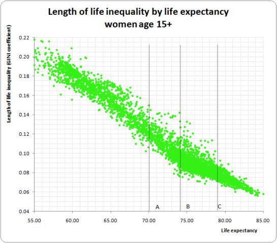
To get a clear overview of the way in which adult length of life inequality varies across societies, we have plotted adult length of life inequality against life expectancy for men and women separately in Figures 1a and 1b. Each dot in these figures represents a male or female life table for a certain country in a certain year. The figures are restricted to the basic pattern of MI and LE in more or less normal situations. Country-year combinations with extremely low life expectancy due to severe calamities (wars, epidemics, famines) are excluded. Figures including severe calamities can be found here.
Figure 1a
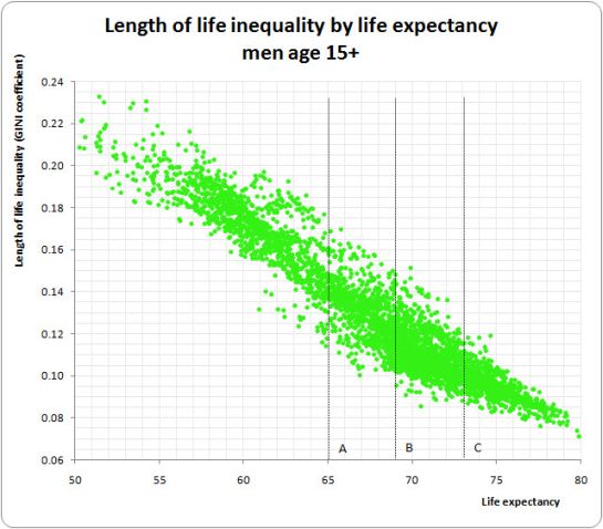
The figures show that for both males and females, the dots are concentrated in elongated cigar-like clouds running from the upper left to the lower right, thus reflecting a strong negative correlation between life expectancy and length of life inequality. However, this correlation is only one part of the story, for at each level of life expectancy we observe considerable variation between societies with lower and societies with higher inequality. For example, for populations with a life expectancy of 65 (marked A in Fig. 1), male inequality varies roughly between 0.12 and 0.16 and for populations with a life expectancy of 73 (marked C) between 0.09 and 0.12. Similar variation is observed for females.
Figure 1b
These results make clear that, besides the average number of years of life available in a society, also the way in which these years of life are distributed among the population members
varies considerably among societies and time periods. They also show that the absolute level of length of life inequality is not a meaningful measure, because whether a specific level of
inequality is high or low depends on the population's position on the life expectancy axis. A male length of life inequality of 0.12 is relatively low in populations with a life expectancy of
65, but it is high in populations with a life expectancy of 73.
To get a better indicator of length of life inequality in a given population, inequality in that population should be compared with inequality in other populations at the same level of life expectancy. In our paper, this degree of length of life inequality in comparison with other populations at the same level of life expectancy is called relative length of life inequality or RLI.
Magnitude of differences
To get a more appealing impression of the magnitude of the inequality differences among countries at the same level of life expectancy, we have translated them into premature mortality rates. Figure 2 presents the number of deaths in the 15-50 age group by RLI quintiles for men and women at three arbitrary levels of life expectancy, marked A, B, and C in Figures 1 and 2. Because they refer to populations with similar life expectancy, these premature mortality rates are well comparable.
Figure 2
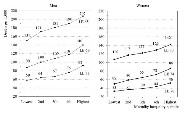
Figure 2 shows that at the same level of life expectancy substantial differences in premature mortality exist. In populations with an adult male life expectancy of 73 (72.5 - 73.5), the average number of men dying before age 50 is 58 per 1,000 in the most equal quintile of societies. This number increases by each quintile until it reaches a level of 92 per 1000 in the most unequal quintile of societies.
This means that at a life expectancy of 73, premature mortality among men is as much as 34 per 1000 or 59% higher in the most unequal societies compared to the most equal ones. For societies with a life expectancy of 69, the difference in premature mortality between the lowest and highest quintiles of RLI is almost the same: 58%.
At a life expectancy of 65, the difference is somewhat lower, but with 37% still substantial. For women we find similar differences, ranging from 33% at a life expectancy of 70, to 72% at a life expectancy of 74. These huge differences in premature mortality (all significant at p<0.001) stress the importance of RLI as an indicator of mortality differences among populations.
Trajectories of countries
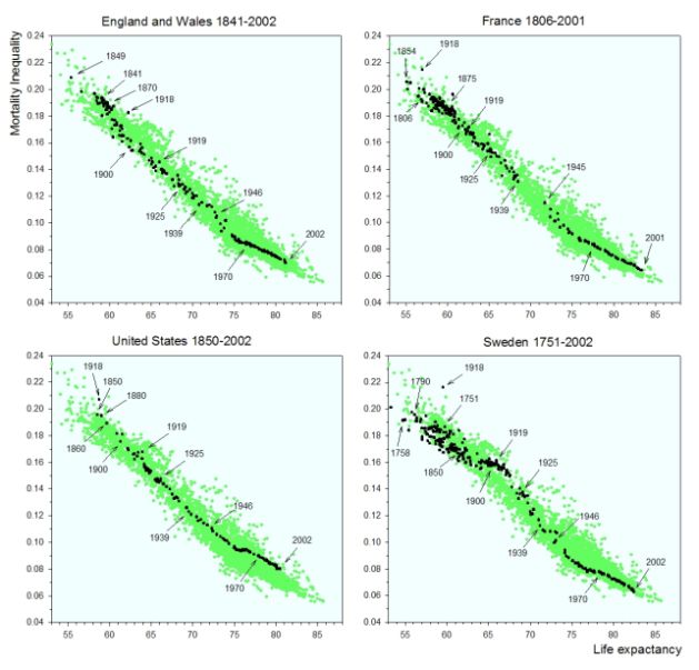
An illuminating extension of the foregoing can be obtained by highlighting the trajectories described by individual countries through the dotted areas in Figure 1. Such trajectories for men from England and Wales, France, the US and Sweden are presented in Figure 3.
This figure shows that the country-specific trajectories are not steadily decreasing chronological lines, but that, depending on what happens in the country in a given year, the trajectory
may move forward and backward through the cloud of dots.
Figure 3
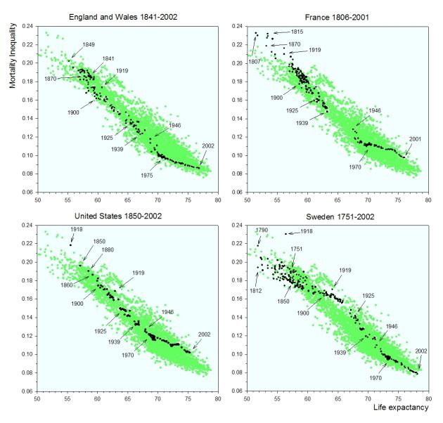
For three of the four countries, the first observation at the upper left corner is not for the first observed year (e.g. for Sweden it is 1790 instead of 1751). Even after 1950, there are many years in which life expectancy is slightly lower than in the preceding year. For the four countries in Figure 5, such a decrease was observed for 28% (men) and 23% (women) of the annual changes since 1950.
The trajectories reveal interesting variations, both within and among countries, like changes into the direction of more or of less equality and periods of acceleration and deceleration. The trajectory for England & Wales is mostly located near the lower boundary, indicating that during most of the 160-year period, RLI among men in this country was low. The French observations, on the other hand, were located in the upper part of the cloud for a substantial part of time. Thus, over most of the period observed, male RLI was higher in France than in England & Wales.
For the US, we see high levels of RLI in the 19th and early 20th century, followed by a period of moderate inequality until the 1970s, after which RLI rises again to reach a relatively high level in the 1990s. Sweden shows much variation in the 18th and 19th century, followed by a period of high RLI in the first half of the 20th century. After World War II, Sweden moves towards the lower part of the cloud, reaching a level of relatively low inequality in 2005.
In Fig. 4, comparable trajectories are presented for women. The pictures are quite similar to those for men. However, since WWII, RLI for women in England &Wales was less favorable than for men, whereas in France it was more favorable.
Figure 4